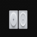
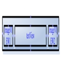
今天我们要来看一款非常特别的纯CSS3 3D按钮,它的外观酷似纯白剔透的牛奶,点击按钮的时候还会出现一种很柔和的弹力效果。按钮按下时,按钮会轻轻的弹动一下,非常逼真。本文我们在观赏演示的同时,也将源代码分享出来一起学习。
class="alignnone size-full wp-image-160" src="/Upload/Images/2014080819/D13E27FC19BB2134.jpg" alt="css3-3d-milk-style-button" width="588" height="281" />
你也可以在这里查看在线演示
接下来我们来分析一下实现这款CSS3 3D按钮的步骤及其代码,总体而言,这款CSS3 3D按钮主要由HTML代码和CSS代码组成。实现原理是用两个span来替代checkbox选中和不选中两个状态的样式。
<div>
    <div>
        <input type="checkbox">
        <span></span>
        <span>+</span>
    </div>
    <div>
        <input type="checkbox" checked>
        <span></span>
        <span>–</span>
    </div>
</div>
HTML代码很简单,我们可以看出每个checkbox下面均定义了2个span,通过对这两个span样式的定义,我们就可以模拟出checkbox选中的动画效果了。
.toggle {
  margin: 4px;
  display: inline-block;
}

.toggle {
  box-shadow: inset 0 0 35px 5px rgba(0, 0, 0, 0.25), inset 0 2px 1px 1px rgba(255, 255, 255, 0.9), inset 0 -2px 1px 0 rgba(0, 0, 0, 0.25);
  border-radius: 8px;
  background: #ccd0d4;
  position: relative;
  height: 140px;
  width: 140px;
}
.toggle:before {
  box-shadow: 0 0 17.5px 8.75px white;
  border-radius: 118.3px;
  background: white;
  position: absolute;
  margin-left: -50.4px;
  margin-top: -50.4px;
  opacity: 0.2;
  content: "";
  height: 100.8px;
  width: 100.8px;
  left: 50%;
  top: 50%;
}
.toggle .button {
  -webkit-filter: blur(1px);
  -moz-filter: blur(1px);
  filter: blur(1px);
  transition: all 300ms cubic-bezier(0.23, 1, 0.32, 1);
  box-shadow: 0 15px 25px -4px rgba(0, 0, 0, 0.5), inset 0 -3px 4px -1px rgba(0, 0, 0, 0.2), 0 -10px 15px -1px rgba(255, 255, 255, 0.6), inset 0 3px 4px -1px rgba(255, 255, 255, 0.2), inset 0 0 5px 1px rgba(255, 255, 255, 0.8), inset 0 20px 30px 0 rgba(255, 255, 255, 0.2);
  border-radius: 96.32px;
  position: absolute;
  background: #ccd0d4;
  margin-left: -48.16px;
  margin-top: -48.16px;
  display: block;
  height: 96.32px;
  width: 96.32px;
  left: 50%;
  top: 50%;
}
.toggle .label {
  transition: color 300ms ease-out;
  text-shadow: 1px 1px 3px #ccd0d4, 0 0 0 rgba(0, 0, 0, 0.8), 1px 1px 4px white;
  line-height: 139px;
  text-align: center;
  position: absolute;
  font-weight: 700;
  font-size: 42px;
  display: block;
  opacity: 0.9;
  height: 100%;
  width: 100%;
  color: rgba(0, 0, 0, 0.4);
}
.toggle input {
  opacity: 0;
  position: absolute;
  cursor: pointer;
  z-index: 1;
  height: 100%;
  width: 100%;
  left: 0;
  top: 0;
}
.toggle input:active ~ .button {
  box-shadow: 0 15px 25px -4px rgba(0, 0, 0, 0.4), inset 0 -8px 30px 1px rgba(255, 255, 255, 0.9), 0 -10px 15px -1px rgba(255, 255, 255, 0.6), inset 0 8px 25px 0 rgba(0, 0, 0, 0.4), inset 0 0 10px 1px rgba(255, 255, 255, 0.6);
}
.toggle input:active ~ .label {
  font-size: 40px;
  color: rgba(0, 0, 0, 0.45);
}
.toggle input:checked ~ .button {
  box-shadow: 0 15px 25px -4px rgba(0, 0, 0, 0.4), inset 0 -8px 25px -1px rgba(255, 255, 255, 0.9), 0 -10px 15px -1px rgba(255, 255, 255, 0.6), inset 0 8px 20px 0 rgba(0, 0, 0, 0.2), inset 0 0 5px 1px rgba(255, 255, 255, 0.6);
}
.toggle input:checked ~ .label {
  font-size: 40px;
  color: rgba(0, 0, 0, 0.4);
}
也没什么特别的,基本都是CSS3常用的一些属性,阴影动画什么的,我们只是通过对颜色的选取,以及合理地运用阴影特效,才用纯CSS3描绘出一个3D立体如牛奶般剔透的按钮动画特效。源代码下载>>


 相关文章
相关文章