估计有不少人像我一样,在尝试使用swing的时候,发现其界面十分难看。
百度搜索说,“swing不像awt有着漂亮的界面……”,因此,我本以为这就是一个无解的问题了。
后来我用上了WindowBuilder(一款很不错的swing/awt可视化界面设计eclipse插件),才发现了LookAndFeel这个东西。
我知道了原先那个最难看的风格叫做MetalLookAndFeel。
比如说WindowsLookAndFeel(Windows风格),MotifLookAndFeel(linux风格),NimbusLookAndFeel(mac风格)等等,他们让我看到了一线曙光。
但是新的问题又随之而来:如果想自定义界面又应该怎么办呢?
百度搜索找到的答案:覆盖(继承)swing组件,覆盖paint(),paintComponent(),paintBorder(),paintChildren()方法。
听起来很靠谱的样子。
不过这并不是我想说的,因为覆盖所有的组件既费时又麻烦,还容易出错。
就比如说如果你想覆盖JTree的样式,渲染部分恐怕会叫你疯掉。
所以现在隆重推出我的方法:覆盖Theme。
什么意思呢?就是创建一个类,继承MetalTheme(为了简单最好直接覆盖OceanTheme)。
好了,进入正题。
?
当我们先前说过,MetalLookAndFeel中最难看的一个,可我现在发现,我错了。
的确,Metal样式的默认风格确实很难看,但它被做出来本来就不是为了让你直接用的。
实际上,MetalLookAndFeel是所有LookAndFeel中架构最好,而且完全平台独立的一个。
我们贴上一段代码,先来看看MetalLookAndFeel中的架构:(以下代码出自jdk自带的源码,有点长,不想看的可以直接跳过)
class="java" name="code">/*
 * Copyright (c) 1998, 2006, Oracle and/or its affiliates. All rights reserved.
 * ORACLE PROPRIETARY/CONFIDENTIAL. Use is subject to license terms.
 *
 *
 *
 *
 *
 *
 *
 *
 *
 *
 *
 *
 *
 *
 *
 *
 *
 *
 *
 *
 */

package javax.swing.plaf.metal;

import javax.swing.plaf.*;
import javax.swing.*;

/**
 * {@code MetalTheme} provides the color palette and fonts used by
 * the Java Look and Feel.
 * <p>
 * {@code MetalTheme} is abstract, see {@code DefaultMetalTheme} and
 * {@code OceanTheme} for concrete implementations.
 * <p>
 * {@code MetalLookAndFeel} maintains the current theme that the
 * the {@code ComponentUI} implementations for metal use. Refer to
 * {@link MetalLookAndFeel#setCurrentTheme
 * MetalLookAndFeel.setCurrentTheme(MetalTheme)} for details on changing
 * the current theme.
 * <p>
 * {@code MetalTheme} provides a number of public methods for getting
 * colors. These methods are implemented in terms of a
 * handful of protected abstract methods. A subclass need only override
 * the protected abstract methods ({@code getPrimary1},
 * {@code getPrimary2}, {@code getPrimary3}, {@code getSecondary1},
 * {@code getSecondary2}, and {@code getSecondary3}); although a subclass
 * may override the other public methods for more control over the set of
 * colors that are used.
 * <p>
 * Concrete implementations of {@code MetalTheme} must return {@code non-null}
 * values from all methods. While the behavior of returning {@code null} is
 * not specified, returning {@code null} will result in incorrect behavior.
 * <p>
 * It is strongly recommended that subclasses return completely opaque colors.
 * To do otherwise may result in rendering problems, such as visual garbage.
 *
 * @see DefaultMetalTheme
 * @see OceanTheme
 * @see MetalLookAndFeel#setCurrentTheme
 *
 * @author Steve Wilson
 */
public abstract class MetalTheme {

    // Contants identifying the various Fonts that are Theme can support
    static final int CONTROL_TEXT_FONT = 0;
    static final int SYSTEM_TEXT_FONT = 1;
    static final int USER_TEXT_FONT = 2;
    static final int MENU_TEXT_FONT = 3;
    static final int WINDOW_TITLE_FONT = 4;
    static final int SUB_TEXT_FONT = 5;

    static ColorUIResource white = new ColorUIResource( 255, 255, 255 );
    private static ColorUIResource black = new ColorUIResource( 0, 0, 0 );

    /**
     * Returns the name of this theme.
     *
     * @return the name of this theme
     */
    public abstract String getName();

    /**
     * Returns the primary 1 color.
     *
     * @return the primary 1 color
     */
    protected abstract ColorUIResource getPrimary1();  // these are blue in Metal Default Theme

    /**
     * Returns the primary 2 color.
     *
     * @return the primary 2 color
     */
    protected abstract ColorUIResource getPrimary2();

    /**
     * Returns the primary 3 color.
     *
     * @return the primary 3 color
     */
    protected abstract ColorUIResource getPrimary3();

    /**
     * Returns the secondary 1 color.
     *
     * @return the secondary 1 color
     */
    protected abstract ColorUIResource getSecondary1();  // these are gray in Metal Default Theme

    /**
     * Returns the secondary 2 color.
     *
     * @return the secondary 2 color
     */
    protected abstract ColorUIResource getSecondary2();

    /**
     * Returns the secondary 3 color.
     *
     * @return the secondary 3 color
     */
    protected abstract ColorUIResource getSecondary3();

    /**
     * Returns the control text font.
     *
     * @return the control text font
     */
    public abstract FontUIResource getControlTextFont();

    /**
     * Returns the system text font.
     *
     * @return the system text font
     */
    public abstract FontUIResource getSystemTextFont();

    /**
     * Returns the user text font.
     *
     * @return the user text font
     */
    public abstract FontUIResource getUserTextFont();

    /**
     * Returns the menu text font.
     *
     * @return the menu text font
     */
    public abstract FontUIResource getMenuTextFont();

    /**
     * Returns the window title font.
     *
     * @return the window title font
     */
    public abstract FontUIResource getWindowTitleFont();

    /**
     * Returns the sub-text font.
     *
     * @return the sub-text font
     */
    public abstract FontUIResource getSubTextFont();

    /**
     * Returns the white color. This returns opaque white
     * ({@code 0xFFFFFFFF}).
     *
     * @return the white color
     */
    protected ColorUIResource getWhite() { return white; }

    /**
     * Returns the black color. This returns opaque black
     * ({@code 0xFF000000}).
     *
     * @return the black color
     */
    protected ColorUIResource getBlack() { return black; }

    /**
     * Returns the focus color. This returns the value of
     * {@code getPrimary2()}.
     *
     * @return the focus color
     */
    public ColorUIResource getFocusColor() { return getPrimary2(); }

    /**
     * Returns the desktop color. This returns the value of
     * {@code getPrimary2()}.
     *
     * @return the desktop color
     */
    public  ColorUIResource getDesktopColor() { return getPrimary2(); }

    /**
     * Returns the control color. This returns the value of
     * {@code getSecondary3()}.
     *
     * @return the control color
     */
    public ColorUIResource getControl() { return getSecondary3(); }

    /**
     * Returns the control shadow color. This returns
     * the value of {@code getSecondary2()}.
     *
     * @return the control shadow color
     */
    public ColorUIResource getControlShadow() { return getSecondary2(); }

    /**
     * Returns the control dark shadow color. This returns
     * the value of {@code getSecondary1()}.
     *
     * @return the control dark shadow color
     */
    public ColorUIResource getControlDarkShadow() { return getSecondary1(); }

    /**
     * Returns the control info color. This returns
     * the value of {@code getBlack()}.
     *
     * @return the control info color
     */
    public ColorUIResource getControlInfo() { return getBlack(); }

    /**
     * Returns the control highlight color. This returns
     * the value of {@code getWhite()}.
     *
     * @return the control highlight color
     */
    public ColorUIResource getControlHighlight() { return getWhite(); }

    /**
     * Returns the control disabled color. This returns
     * the value of {@code getSecondary2()}.
     *
     * @return the control disabled color
     */
    public ColorUIResource getControlDisabled() { return getSecondary2(); }

    /**
     * Returns the primary control color. This returns
     * the value of {@code getPrimary3()}.
     *
     * @return the primary control color
     */
    public ColorUIResource getPrimaryControl() { return getPrimary3(); }

    /**
     * Returns the primary control shadow color. This returns
     * the value of {@code getPrimary2()}.
     *
     * @return the primary control shadow color
     */
    public ColorUIResource getPrimaryControlShadow() { return getPrimary2(); }
    /**
     * Returns the primary control dark shadow color. This
     * returns the value of {@code getPrimary1()}.
     *
     * @return the primary control dark shadow color
     */
    public ColorUIResource getPrimaryControlDarkShadow() { return getPrimary1(); }

    /**
     * Returns the primary control info color. This
     * returns the value of {@code getBlack()}.
     *
     * @return the primary control info color
     */
    public ColorUIResource getPrimaryControlInfo() { return getBlack(); }

    /**
     * Returns the primary control highlight color. This
     * returns the value of {@code getWhite()}.
     *
     * @return the primary control highlight color
     */
    public ColorUIResource getPrimaryControlHighlight() { return getWhite(); }

    /**
     * Returns the system text color. This returns the value of
     * {@code getBlack()}.
     *
     * @return the system text color
     */
    public ColorUIResource getSystemTextColor() { return getBlack(); }

    /**
     * Returns the control text color. This returns the value of
     * {@code getControlInfo()}.
     *
     * @return the control text color
     */
    public ColorUIResource getControlTextColor() { return getControlInfo(); }

    /**
     * Returns the inactive control text color. This returns the value of
     * {@code getControlDisabled()}.
     *
     * @return the inactive control text color
     */
    public ColorUIResource getInactiveControlTextColor() { return getControlDisabled(); }

    /**
     * Returns the inactive system text color. This returns the value of
     * {@code getSecondary2()}.
     *
     * @return the inactive system text color
     */
    public ColorUIResource getInactiveSystemTextColor() { return getSecondary2(); }

    /**
     * Returns the user text color. This returns the value of
     * {@code getBlack()}.
     *
     * @return the user text color
     */
    public ColorUIResource getUserTextColor() { return getBlack(); }

    /**
     * Returns the text highlight color. This returns the value of
     * {@code getPrimary3()}.
     *
     * @return the text highlight color
     */
    public ColorUIResource getTextHighlightColor() { return getPrimary3(); }

    /**
     * Returns the highlighted text color. This returns the value of
     * {@code getControlTextColor()}.
     *
     * @return the highlighted text color
     */
    public ColorUIResource getHighlightedTextColor() { return getControlTextColor(); }

    /**
     * Returns the window background color. This returns the value of
     * {@code getWhite()}.
     *
     * @return the window background color
     */
    public ColorUIResource getWindowBackground() { return getWhite(); }

    /**
     * Returns the window title background color. This returns the value of
     * {@code getPrimary3()}.
     *
     * @return the window title background color
     */
    public ColorUIResource getWindowTitleBackground() { return getPrimary3(); }

    /**
     * Returns the window title foreground color. This returns the value of
     * {@code getBlack()}.
     *
     * @return the window title foreground color
     */
    public ColorUIResource getWindowTitleForeground() { return getBlack(); }

    /**
     * Returns the window title inactive background color. This
     * returns the value of {@code getSecondary3()}.
     *
     * @return the window title inactive background color
     */
    public ColorUIResource getWindowTitleInactiveBackground() { return getSecondary3(); }

    /**
     * Returns the window title inactive foreground color. This
     * returns the value of {@code getBlack()}.
     *
     * @return the window title inactive foreground color
     */
    public ColorUIResource getWindowTitleInactiveForeground() { return getBlack(); }

    /**
     * Returns the menu background color. This
     * returns the value of {@code getSecondary3()}.
     *
     * @return the menu background color
     */
    public ColorUIResource getMenuBackground() { return getSecondary3(); }

    /**
     * Returns the menu foreground color. This
     * returns the value of {@code getBlack()}.
     *
     * @return the menu foreground color
     */
    public ColorUIResource getMenuForeground() { return  getBlack(); }

    /**
     * Returns the menu selected background color. This
     * returns the value of {@code getPrimary2()}.
     *
     * @return the menu selected background color
     */
    public ColorUIResource getMenuSelectedBackground() { return getPrimary2(); }

    /**
     * Returns the menu selected foreground color. This
     * returns the value of {@code getBlack()}.
     *
     * @return the menu selected foreground color
     */
    public ColorUIResource getMenuSelectedForeground() { return getBlack(); }

    /**
     * Returns the menu disabled foreground color. This
     * returns the value of {@code getSecondary2()}.
     *
     * @return the menu disabled foreground color
     */
    public ColorUIResource getMenuDisabledForeground() { return getSecondary2(); }

    /**
     * Returns the separator background color. This
     * returns the value of {@code getWhite()}.
     *
     * @return the separator background color
     */
    public ColorUIResource getSeparatorBackground() { return getWhite(); }

    /**
     * Returns the separator foreground color. This
     * returns the value of {@code getPrimary1()}.
     *
     * @return the separator foreground color
     */
    public ColorUIResource getSeparatorForeground() { return getPrimary1(); }

    /**
     * Returns the accelerator foreground color. This
     * returns the value of {@code getPrimary1()}.
     *
     * @return the accelerator foreground color
     */
    public ColorUIResource getAcceleratorForeground() { return getPrimary1(); }

    /**
     * Returns the accelerator selected foreground color. This
     * returns the value of {@code getBlack()}.
     *
     * @return the accelerator selected foreground color
     */
    public ColorUIResource getAcceleratorSelectedForeground() { return getBlack(); }

    /**
     * Adds values specific to this theme to the defaults table. This method
     * is invoked when the look and feel defaults are obtained from
     * {@code MetalLookAndFeel}.
     * <p>
     * This implementation does nothing; it is provided for subclasses
     * that wish to customize the defaults table.
     *
     * @param table the {@code UIDefaults} to add the values to
     *
     * @see MetalLookAndFeel#getDefaults
     */
    public void addCustomEntriesToTable(UIDefaults table) {}

    /**
     * This is invoked when a MetalLookAndFeel is installed and about to
     * start using this theme. When we can add API this should be nuked
     * in favor of DefaultMetalTheme overriding addCustomEntriesToTable.
     */
    void install() {
    }

    /**
     * Returns true if this is a theme provided by the core platform.
     */
    boolean isSystemTheme() {
        return false;
    }
}
?不管你有没有认真看代码,我想说的就是:这个东西叫做Theme,即风格,就像安卓中的Holo。他不像LookAndFeel要提供无数个供渲染的类,只要提供一些属性,比如颜色等等,就可以了。
再看OceanTheme(默认Theme):(其实OceanTheme覆盖了DefaultMetalTheme,不过DefaultMetalTheme实在没什么内容,就不贴出来了)
/*
 * Copyright (c) 2003, 2006, Oracle and/or its affiliates. All rights reserved.
 * ORACLE PROPRIETARY/CONFIDENTIAL. Use is subject to license terms.
 *
 *
 *
 *
 *
 *
 *
 *
 *
 *
 *
 *
 *
 *
 *
 *
 *
 *
 *
 *
 */

package javax.swing.plaf.metal;

import java.awt.*;
import java.net.URL;
import java.util.*;
import javax.swing.*;
import javax.swing.plaf.*;
import sun.swing.SwingUtilities2;
import sun.swing.PrintColorUIResource;
import sun.swing.SwingLazyValue;

/**
 * The default theme for the {@code MetalLookAndFeel}.
 * <p>
 * The designers
 * of the Metal Look and Feel strive to keep the default look up to
 * date, possibly through the use of new themes in the future.
 * Therefore, developers should only use this class directly when they
 * wish to customize the "Ocean" look, or force it to be the current
 * theme, regardless of future updates.

 * <p>
 * All colors returned by {@code OceanTheme} are completely
 * opaque.
 *
 * @since 1.5
 * @see MetalLookAndFeel#setCurrentTheme
 */
public class OceanTheme extends DefaultMetalTheme {
    private static final ColorUIResource PRIMARY1 =
                              new ColorUIResource(0x6382BF);
    private static final ColorUIResource PRIMARY2 =
                              new ColorUIResource(0xA3B8CC);
    private static final ColorUIResource PRIMARY3 =
                              new ColorUIResource(0xB8CFE5);
    private static final ColorUIResource SECONDARY1 =
                              new ColorUIResource(0x7A8A99);
    private static final ColorUIResource SECONDARY2 =
                              new ColorUIResource(0xB8CFE5);
    private static final ColorUIResource SECONDARY3 =
                              new ColorUIResource(0xEEEEEE);

    private static final ColorUIResource CONTROL_TEXT_COLOR =
                              new PrintColorUIResource(0x333333, Color.BLACK);
    private static final ColorUIResource INACTIVE_CONTROL_TEXT_COLOR =
                              new ColorUIResource(0x999999);
    private static final ColorUIResource MENU_DISABLED_FOREGROUND =
                              new ColorUIResource(0x999999);
    private static final ColorUIResource OCEAN_BLACK =
                              new PrintColorUIResource(0x333333, Color.BLACK);

    private static final ColorUIResource OCEAN_DROP =
                              new ColorUIResource(0xD2E9FF);

    // ComponentOrientation Icon
    // Delegates to different icons based on component orientation
    private static class COIcon extends IconUIResource {
        private Icon rtl;

        public COIcon(Icon ltr, Icon rtl) {
            super(ltr);
            this.rtl = rtl;
        }

        public void paintIcon(Component c, Graphics g, int x, int y) {
            if (MetalUtils.isLeftToRight(c)) {
                super.paintIcon(c, g, x, y);
            } else {
                rtl.paintIcon(c, g, x, y);
            }
        }
    }

    // InternalFrame Icon
    // Delegates to different icons based on button state
    private static class IFIcon extends IconUIResource {
        private Icon pressed;

        public IFIcon(Icon normal, Icon pressed) {
            super(normal);
            this.pressed = pressed;
        }

        public void paintIcon(Component c, Graphics g, int x, int y) {
            ButtonModel model = ((AbstractButton)c).getModel();
            if (model.isPressed() && model.isArmed()) {
                pressed.paintIcon(c, g, x, y);
            } else {
                super.paintIcon(c, g, x, y);
            }
        }
    }

    /**
     * Creates an instance of <code>OceanTheme</code>
     */
    public OceanTheme() {
    }

    /**
     * Add this theme's custom entries to the defaults table.
     *
     * @param table the defaults table, non-null
     * @throws NullPointerException if {@code table} is {@code null}
     */
    public void addCustomEntriesToTable(UIDefaults table) {
        Object focusBorder = new SwingLazyValue(
                      "javax.swing.plaf.BorderUIResource$LineBorderUIResource",
                      new Object[] {getPrimary1()});
        // .30 0 DDE8F3 white secondary2
        java.util.List buttonGradient = Arrays.asList(
                 new Object[] {new Float(.3f), new Float(0f),
                 new ColorUIResource(0xDDE8F3), getWhite(), getSecondary2() });

        // Other possible properties that aren't defined:
        //
        // Used when generating the disabled Icons, provides the region to
        // constrain grays to.
        // Button.disabledGrayRange -> Object[] of Integers giving min/max
        // InternalFrame.inactiveTitleGradient -> Gradient when the
        //   internal frame is inactive.
        Color cccccc = new ColorUIResource(0xCCCCCC);
        Color dadada = new ColorUIResource(0xDADADA);
        Color c8ddf2 = new ColorUIResource(0xC8DDF2);
        Object directoryIcon = getIconResource("icons/ocean/directory.gif");
        Object fileIcon = getIconResource("icons/ocean/file.gif");
        java.util.List sliderGradient = Arrays.asList(new Object[] {
            new Float(.3f), new Float(.2f),
            c8ddf2, getWhite(), new ColorUIResource(SECONDARY2) });

        Object[] defaults = new Object[] {
            "Button.gradient", buttonGradient,
            "Button.rollover", Boolean.TRUE,
            "Button.toolBarBorderBackground", INACTIVE_CONTROL_TEXT_COLOR,
            "Button.disabledToolBarBorderBackground", cccccc,
            "Button.rolloverIconType", "ocean",

            "CheckBox.rollover", Boolean.TRUE,
            "CheckBox.gradient", buttonGradient,

            "CheckBoxMenuItem.gradient", buttonGradient,

            // home2
            "FileChooser.homeFolderIcon",
                 getIconResource("icons/ocean/homeFolder.gif"),
            // directory2
            "FileChooser.newFolderIcon",
                 getIconResource("icons/ocean/newFolder.gif"),
            // updir2
            "FileChooser.upFolderIcon",
                 getIconResource("icons/ocean/upFolder.gif"),

            // computer2
            "FileView.computerIcon",
                 getIconResource("icons/ocean/computer.gif"),
            "FileView.directoryIcon", directoryIcon,
            // disk2
            "FileView.hardDriveIcon",
                 getIconResource("icons/ocean/hardDrive.gif"),
            "FileView.fileIcon", fileIcon,
            // floppy2
            "FileView.floppyDriveIcon",
                 getIconResource("icons/ocean/floppy.gif"),

            "Label.disabledForeground", getInactiveControlTextColor(),

            "Menu.opaque", Boolean.FALSE,

            "MenuBar.gradient", Arrays.asList(new Object[] {
                     new Float(1f), new Float(0f),
                     getWhite(), dadada,
                     new ColorUIResource(dadada) }),
            "MenuBar.borderColor", cccccc,

            "InternalFrame.activeTitleGradient", buttonGradient,
            // close2
            "InternalFrame.closeIcon",
                     new UIDefaults.LazyValue() {
                         public Object createValue(UIDefaults table) {
                             return new IFIcon(getHastenedIcon("icons/ocean/close.gif", table),
                                               getHastenedIcon("icons/ocean/close-pressed.gif", table));
                         }
                     },
            // minimize
            "InternalFrame.iconifyIcon",
                     new UIDefaults.LazyValue() {
                         public Object createValue(UIDefaults table) {
                             return new IFIcon(getHastenedIcon("icons/ocean/iconify.gif", table),
                                               getHastenedIcon("icons/ocean/iconify-pressed.gif", table));
                         }
                     },
            // restore
            "InternalFrame.minimizeIcon",
                     new UIDefaults.LazyValue() {
                         public Object createValue(UIDefaults table) {
                             return new IFIcon(getHastenedIcon("icons/ocean/minimize.gif", table),
                                               getHastenedIcon("icons/ocean/minimize-pressed.gif", table));
                         }
                     },
            // menubutton3
            "InternalFrame.icon",
                     getIconResource("icons/ocean/menu.gif"),
            // maximize2
            "InternalFrame.maximizeIcon",
                     new UIDefaults.LazyValue() {
                         public Object createValue(UIDefaults table) {
                             return new IFIcon(getHastenedIcon("icons/ocean/maximize.gif", table),
                                               getHastenedIcon("icons/ocean/maximize-pressed.gif", table));
                         }
                     },
            // paletteclose
            "InternalFrame.paletteCloseIcon",
                     new UIDefaults.LazyValue() {
                         public Object createValue(UIDefaults table) {
                             return new IFIcon(getHastenedIcon("icons/ocean/paletteClose.gif", table),
                                               getHastenedIcon("icons/ocean/paletteClose-pressed.gif", table));
                         }
                     },

            "List.focusCellHighlightBorder", focusBorder,

            "MenuBarUI", "javax.swing.plaf.metal.MetalMenuBarUI",

            "OptionPane.errorIcon",
                   getIconResource("icons/ocean/error.png"),
            "OptionPane.informationIcon",
                   getIconResource("icons/ocean/info.png"),
            "OptionPane.questionIcon",
                   getIconResource("icons/ocean/question.png"),
            "OptionPane.warningIcon",
                   getIconResource("icons/ocean/warning.png"),

            "RadioButton.gradient", buttonGradient,
            "RadioButton.rollover", Boolean.TRUE,

            "RadioButtonMenuItem.gradient", buttonGradient,

            "ScrollBar.gradient", buttonGradient,

            "Slider.altTrackColor", new ColorUIResource(0xD2E2EF),
            "Slider.gradient", sliderGradient,
            "Slider.focusGradient", sliderGradient,

            "SplitPane.oneTouchButtonsOpaque", Boolean.FALSE,
            "SplitPane.dividerFocusColor", c8ddf2,

            "TabbedPane.borderHightlightColor", getPrimary1(),
            "TabbedPane.contentAreaColor", c8ddf2,
            "TabbedPane.contentBorderInsets", new Insets(4, 2, 3, 3),
            "TabbedPane.selected", c8ddf2,
            "TabbedPane.tabAreaBackground", dadada,
            "TabbedPane.tabAreaInsets", new Insets(2, 2, 0, 6),
            "TabbedPane.unselectedBackground", SECONDARY3,

            "Table.focusCellHighlightBorder", focusBorder,
            "Table.gridColor", SECONDARY1,
            "TableHeader.focusCellBackground", c8ddf2,

            "ToggleButton.gradient", buttonGradient,

            "ToolBar.borderColor", cccccc,
            "ToolBar.isRollover", Boolean.TRUE,

            "Tree.closedIcon", directoryIcon,

            "Tree.collapsedIcon",
                  new UIDefaults.LazyValue() {
                      public Object createValue(UIDefaults table) {
                          return new COIcon(getHastenedIcon("icons/ocean/collapsed.gif", table),
                                            getHastenedIcon("icons/ocean/collapsed-rtl.gif", table));
                      }
                  },

            "Tree.expandedIcon",
                  getIconResource("icons/ocean/expanded.gif"),
            "Tree.leafIcon", fileIcon,
            "Tree.openIcon", directoryIcon,
            "Tree.selectionBorderColor", getPrimary1(),
            "Tree.dropLineColor", getPrimary1(),
            "Table.dropLineColor", getPrimary1(),
            "Table.dropLineShortColor", OCEAN_BLACK,

            "Table.dropCellBackground", OCEAN_DROP,
            "Tree.dropCellBackground", OCEAN_DROP,
            "List.dropCellBackground", OCEAN_DROP,
            "List.dropLineColor", getPrimary1()
        };
        table.putDefaults(defaults);
    }

    /**
     * Overriden to enable picking up the system fonts, if applicable.
     */
    boolean isSystemTheme() {
        return true;
    }

    /**
     * Return the name of this theme, "Ocean".
     *
     * @return "Ocean"
     */
    public String getName() {
        return "Ocean";
    }

    /**
     * Returns the primary 1 color. This returns a color with an rgb hex value
     * of {@code 0x6382BF}.
     *
     * @return the primary 1 color
     * @see java.awt.Color#decode
     */
    protected ColorUIResource getPrimary1() {
        return PRIMARY1;
    }

    /**
     * Returns the primary 2 color. This returns a color with an rgb hex value
     * of {@code 0xA3B8CC}.
     *
     * @return the primary 2 color
     * @see java.awt.Color#decode
     */
    protected ColorUIResource getPrimary2() {
        return PRIMARY2;
    }

    /**
     * Returns the primary 3 color. This returns a color with an rgb hex value
     * of {@code 0xB8CFE5}.
     *
     * @return the primary 3 color
     * @see java.awt.Color#decode
     */
    protected ColorUIResource getPrimary3() {
        return PRIMARY3;
    }

    /**
     * Returns the secondary 1 color. This returns a color with an rgb hex
     * value of {@code 0x7A8A99}.
     *
     * @return the secondary 1 color
     * @see java.awt.Color#decode
     */
    protected ColorUIResource getSecondary1() {
        return SECONDARY1;
    }

    /**
     * Returns the secondary 2 color. This returns a color with an rgb hex
     * value of {@code 0xB8CFE5}.
     *
     * @return the secondary 2 color
     * @see java.awt.Color#decode
     */
    protected ColorUIResource getSecondary2() {
        return SECONDARY2;
    }

    /**
     * Returns the secondary 3 color. This returns a color with an rgb hex
     * value of {@code 0xEEEEEE}.
     *
     * @return the secondary 3 color
     * @see java.awt.Color#decode
     */
    protected ColorUIResource getSecondary3() {
        return SECONDARY3;
    }

    /**
     * Returns the black color. This returns a color with an rgb hex
     * value of {@code 0x333333}.
     *
     * @return the black color
     * @see java.awt.Color#decode
     */
    protected ColorUIResource getBlack() {
        return OCEAN_BLACK;
    }

    /**
     * Returns the desktop color. This returns a color with an rgb hex
     * value of {@code 0xFFFFFF}.
     *
     * @return the desktop color
     * @see java.awt.Color#decode
     */
    public ColorUIResource getDesktopColor() {
        return MetalTheme.white;
    }

    /**
     * Returns the inactive control text color. This returns a color with an
     * rgb hex value of {@code 0x999999}.
     *
     * @return the inactive control text color
     */
    public ColorUIResource getInactiveControlTextColor() {
        return INACTIVE_CONTROL_TEXT_COLOR;
    }

    /**
     * Returns the control text color. This returns a color with an
     * rgb hex value of {@code 0x333333}.
     *
     * @return the control text color
     */
    public ColorUIResource getControlTextColor() {
        return CONTROL_TEXT_COLOR;
    }

    /**
     * Returns the menu disabled foreground color. This returns a color with an
     * rgb hex value of {@code 0x999999}.
     *
     * @return the menu disabled foreground color
     */
    public ColorUIResource getMenuDisabledForeground() {
        return MENU_DISABLED_FOREGROUND;
    }

    private Object getIconResource(String iconID) {
        return SwingUtilities2.makeIcon(getClass(), OceanTheme.class, iconID);
    }

    // makes use of getIconResource() to fetch an icon and then hastens it
    // - calls createValue() on it and returns the actual icon
    private Icon getHastenedIcon(String iconID, UIDefaults table) {
        Object res = getIconResource(iconID);
        return (Icon)((UIDefaults.LazyValue)res).createValue(table);
    }
}
?好吧,我相信你好是没有认真看,反正就一句话,一个Theme,一个风格,覆盖Theme就可以覆盖风格。
那么我们最后用一个例子来结尾。
本例中,我覆盖了OceanTheme的"Button.gradient"项(用于渲染弹起时的按钮)。
import java.util.Arrays;

import javax.swing.UIDefaults;
import javax.swing.plaf.ColorUIResource;
import javax.swing.plaf.metal.OceanTheme;

public class MyTheme extends OceanTheme {
	@Override
	public void addCustomEntriesToTable(UIDefaults table) {
		super.addCustomEntriesToTable(table);
		ColorUIResource plainColor = new ColorUIResource(0xDDE8F3);
		java.util.List<Object> buttonGradient = Arrays.asList(new Object[] {
				.5f, 0f, plainColor, plainColor, plainColor });
		table.put("Button.gradient", buttonGradient);
	}
}
?可以看到,我在UIDefaults的实例table中添加了一个项目。他将会被MetalButtonUI读取并渲染出一个纯色的按钮。
用法:
MetalLookAndFeel.setCurrentTheme(new MyTheme());
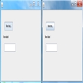
?效果很不错:
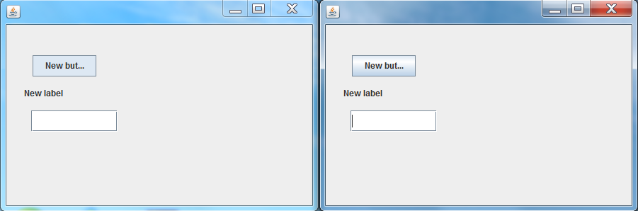
?左边的是更改过的Theme,右边的是未更改的,是不是漂亮多了呢?
?
好了,今天就到这里了,未完待续。


 相关文章
相关文章