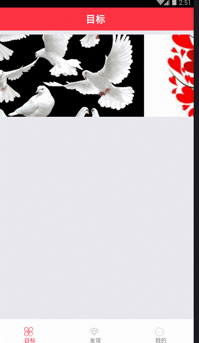
最近项目需求需要用到轮播图,所以写两Demo练练手,不过效果不太理想,希望大牛予以指正。
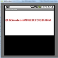
不多说,先上图。
这种轮播很常见,但是一个问题是,总感觉有点卡的感觉,最气人的是,你滑动到哪里,他就听到哪里,给用户感觉很不爽!
下面我分享一下该轮播的代码!
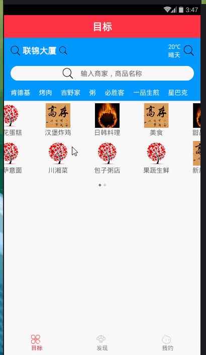
//import liraries
import React, { Component } from 'react';
import { View, Text, StyleSheet, TouchableOpacity, Dimensions, Image, ScrollView } from 'react-native';
import Swiper from 'react-native-swiper';

let { width, height } = Dimensions.get('window');
let Images = [
    { src: require('../assets/images/1.jpg') },
    { src: require('../assets/images/2.jpg') },
    { src: require('../assets/images/3.jpg') },
    { src: require('../assets/images/4.jpg') }
];
const loading = require('../assets/images/loading.gif');

// create a component
class TargetView extends Component {
    static navigationOptions = {
        title: '目标',
        headerStyle: {
            backgroundColor: '#FF3344',
        },
    }

    _renderSwiper() {
        return (
            <Swiper
                style={styles.swiperStyle}
                height={200}
                horizontal={true}
                autolay={true}
                loop={true}
                paginationStyle={{ bottom: 10 }}
                showsPagination={true}
                index={0}
                dotStyle={{ backgroundColor: 'rgba(0,0,0,.2)', width: 6, height: 6 }}
                activeDotStyle={{ backgroundColor: 'rgba(0,0,0,.5)', width: 6, height: 6 }}>
                <View style={styles.swiperItem}>
                    <Image style={styles.imageStyle} source={Images[0].src}></Image>
                </View>
                <View style={styles.swiperItem}>
                    <Image style={styles.imageStyle} source={Images[1].src}></Image>
                </View>
                <View style={styles.swiperItem}>
                    <Image style={styles.imageStyle} source={Images[2].src}></Image>
                </View>
                <View style={styles.swiperItem}>
                    <Image style={styles.imageStyle} source={Images[3].src}></Image>
                </View>
            </Swiper>
        )
    }


    render() {
        return (
            <ScrollView
                style={styles.container}>
                {this._renderSwiper()}
            </ScrollView>
        );
    }
}

// define your styles
const styles = StyleSheet.create({
    container: {
        flex: 1
    },
    swiperStyle: {
        marginTop:10,
        width: width,
    },
    swiperItem: {
        flex: 1,
        justifyContent: 'center',
        backgroundColor: 'transparent',
    },
    imageStyle: {
        flex: 1,
        width:width,
    },
});

//make this component available to the app
export default TargetView;
第二个情况,先上一张图
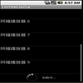
都看到这是仿饿了么的轮播效果,但情况依然很不爽,大牛给出点优化建议啊!
下面我分享一下该轮播的效果,(如果你正在做轮播,做的比较好,谢谢分享我一下,本人虚心学习,微信:jkxx123321)//import liraries import React, { Component } from 'react'; import { View, Text, StyleSheet, Dimensions, Image, TouchableOpacity, TouchableNativeFeedback, TouchableWithoutFeedback, ScrollView, Platform, Animated, } from 'react-native'; import Swiper from 'react-native-swiper'; import px2pd from '../utils/px2dp'; let { width, height } = Dimensions.get('window'); const isIOS = Platform.OS == 'ios'; const headH = px2pd(isIOS ? 140 : 120); const inputHeight = px2pd(28); const imgTypes = [ { src: require('../assets/images/1.jpg') }, { src: require('../assets/images/2.jpg') }, { src: require('../assets/images/3.jpg') }, { src: require('../assets/images/4.jpg') }, { src: require('../assets/images/4.jpg') }, { src: require('../assets/images/1.jpg') }, { src: require('../assets/images/2.jpg') }, { src: require('../assets/images/3.jpg') }, { src: require('../assets/images/4.jpg') }, { src: require('../assets/images/4.jpg') }, { src: require('../assets/images/1.jpg') }, { src: require('../assets/images/2.jpg') }, { src: require('../assets/images/3.jpg') }, { src: require('../assets/images/4.jpg') }, { src: require('../assets/images/4.jpg') }, { src: require('../assets/images/4.jpg') }, { src: require('../assets/images/4.jpg') } ]; const loading = require('../assets/images/loading.gif'); // create a component class TargetView extends Component { static navigationOptions = { title: '目标', headerStyle: { backgroundColor: '#FF3344', }, } constructor(props) { super(props) this.state = { location: "联锦大厦", } } _renderHeader() { return ( <View style={styles.header}> {/*定位、天气*/} <View style={styles.lbsWeather}> <TouchableWithoutFeedback> <View style={styles.lbs}> <Image source={require('../assets/icons/search.png')} style={{ width: px2pd(18), height: px2pd(18) }}></Image> <Text style={{ fontSize: px2pd(16), fontWeight: 'bold', color: '#fff', paddingHorizontal: px2pd(5) }}>{this.state.location}</Text> <Image source={require('../assets/icons/search.png')} style={{ width: px2pd(16), height: px2pd(16) }}></Image> </View> </TouchableWithoutFeedback> <View style={styles.weather}> <View style={{ marginRight: px2pd(5) }}> <Text style={{ fontSize: px2pd(11), color: '#fff', textAlign: 'center' }}>{'20℃'}</Text> <Text style={{ fontSize: px2pd(11), color: '#fff' }}>{'晴天'}</Text> </View> <Image source={require('../assets/icons/search.png')} style={{ width: px2pd(20), height: px2pd(20) }}></Image> </View> </View> {/*搜索框*/} <View style={{ marginTop: px2pd(15), }}> <TouchableWithoutFeedback onPress={() => { }}> <View style={styles.searchBtn}> <Image source={require('../assets/icons/search.png')} style={{ width: px2pd(20), height: px2pd(20) }}></Image> <Text style={{ fontSize: px2pd(13), color: '#666', marginLeft: px2pd(15) }}>{'输入商家,商品名称'}</Text> </View> </TouchableWithoutFeedback> </View> <Animated.View style={styles.keywords}> { ['肯德基', '烤肉', '吉野家', '粥', '必胜客', '一品生煎', '星巴克'].map((item, i) => { return ( <TouchableWithoutFeedback key={i}> <View style={{ marginRight: px2pd(12) }}> <Text style={{ fontSize: px2pd(12), color: '#fff' }}>{item}</Text> </View> </TouchableWithoutFeedback> ) }) } </Animated.View> </View> ) } _renderTypes() { const w = width / 4, h = w * .6 + 20; let renderSwipeView = (types, n) => { return ( <View style={styles.typesView}> { types.map((item, i) => { let render = ( <View style={[{ width: w, height: h }, styles.typesItem]}> <Image source={imgTypes[n + i].src} style={{ width: w * .5, height: w * .5 }} /> <Text style={{ fontSize: px2pd(12), color: "#666" }}>{item}</Text> </View> ) return ( isIOS ? ( <TouchableHighlight style={{ width: w, height: h }} key={i} onPress={() => { }}>{render}</TouchableHighlight> ) : ( <TouchableNativeFeedback style={{ width: w, height: h }} key={i} onPress={() => { }}>{render}</TouchableNativeFeedback> ) ) }) } </View> ) } return ( <Swiper height={h * 2.4} paginationStyle={{ bottom: 10 }} dotStyle={{ backgroundColor: 'rgba(0,0,0,.2)', width: 6, height: 6 }} activeDotStyle={{ backgroundColor: 'rgba(0,0,0,.5)', width: 6, height: 6 }}> {renderSwipeView(['美食', '甜品饮品', '商店超市', '预定早餐', '果蔬生鲜', '新店特惠', '准时达', '高铁订餐'], 0)} {renderSwipeView(['土豪推荐', '鲜花蛋糕', '汉堡炸鸡', '日韩料理', '麻辣烫', '披萨意面', '川湘菜', '包子粥店'], 8)} </Swiper> ) } render() { return ( <View style={styles.container}> <ScrollView style={styles.scrollView}> {this._renderHeader()} <View style={{ backgroundColor: "#fff", paddingBottom: px2pd(10) }}> {this._renderTypes()} </View> </ScrollView> </View> ); } } // define your styles const styles = StyleSheet.create({ container: { flex: 1, backgroundColor: '#f3f3f3', }, scrollView: { marginBottom: px2pd(46), }, header: { backgroundColor: '#0398ff', height: headH, paddingTop: px2pd(isIOS ? 30 : 10), paddingHorizontal: 16, }, lbsWeather: { height: inputHeight, overflow: "hidden", flexDirection: 'row', justifyContent: 'space-between', }, lbs: { flexDirection: 'row', justifyContent: 'center', alignItems: 'center', }, weather: { flexDirection: 'row', alignItems: 'center', }, searchBtn: { borderRadius: inputHeight, height: inputHeight, flexDirection: 'row', backgroundColor: '#fff', justifyContent: 'center', alignItems: 'center', }, keywords: { marginTop: px2pd(14), flexDirection: 'row', justifyContent: 'space-between', }, typesView: { paddingBottom: px2pd(10), flex: 1, backgroundColor: "#fff", flexDirection: "row", flexWrap: "wrap" }, typesItem: { backgroundColor: '#fff', justifyContent: 'center', alignItems: 'center' }, }); //make this component available to the app export default TargetView;
//---------------------px2dp.js------------------------------// import { Dimensions } from 'react-native' const deviceH = Dimensions.get('window').height const deviceW = Dimensions.get('window').width const basePx = 375 export default function px2dp(px) { return px * deviceW / basePx }附一张属性表:
3.1 基本属性
Prop
Default Type Description horizontal true bool 如果值为true时,那么滚动的内容将是横向排列的,而不是垂直于列中的。 loop true bool 如果设置为false,那么滑动到最后一张时,再次滑动将不会展示第一张图片。 index 0 number 初始进入的页面标识为0的页面。 showsButtons false bool 如果设置为true,那么就可以使控制按钮(即:左右两侧的箭头)可见。 autoplay false bool 设置为true,则页面可以自动跳转。3.2 自定义属性
Prop Default Type Description width - number 如果你没有特殊的设置,就通过flex:1默认为全屏。 height - number 如果你没有特殊的设置,就通过flex:1默认为全屏。 style {...} style 设置页面的样式。
3.3 pagination 分页
Prop Default Type Description showsPagination true bool 默认值为true,在页面下边显示圆点,以标明当前页面位于第几个。 paginationStyle {...} style 设置页面原点的样式,自定义的样式会和默认样式进行合并。 renderPagination dot <View style={{backgroundColor:'rgba(0,0,0,.2)', width: 8, height: 8,borderRadius: 4, marginLeft: 3, marginRight: 3, marginTop: 3, marginBottom: 3,}} /> element 可以自定义不是当前圆点的样式 activeDot <View style={{backgroundColor: '#007aff', width: 8, height: 8, borderRadius: 4, marginLeft: 3, marginRight: 3, marginTop: 3, marginBottom: 3,}} /> element 可以自定义当前页面圆点的样式
3.4 自动播放
Prop Default Type Description autoplay true
bool设置为true可以使页面自动滑动。 autoplayTimeout 2.5number设置每个页面自动滑动停留的时间 autoplayDirection truebool圆点的方向允许默认自己控制3.5 控制按钮
Prop Default Type Description showsButtons true
bool是否显示控制箭头按钮 buttonWrapperStyle{position: 'absolute', paddingHorizontal: 15, paddingVertical: 30, top: 70, left: 0, alignItems:'flex-start'}style定义默认箭头按钮的样式 nextButton<Text style={{fontSize:60, color:'#00a7ec', paddingTop:30, paddingBottom:30}}>?</Text>element自定义右箭头按钮样式 prevButton<Text style={{fontSize:60, color:'#00a7ec', paddingTop:30, paddingBottom:30}}>?</Text>element自定义左箭头按钮样式加油!
 相关文章
相关文章
