2013-12-18 11:25:22
转载自: http://www.open-open.com/lib/view/open1328836804515.html
很多时候android常用的控件不能满足我们的需求,那么我们就需要自定义一个控件了。今天做了一个自定义控件的实例,来分享下。
首先定义一个layout实现按钮内部布局:
 1 <?xml version="1.0" encoding="utf-8"?>
 2 <LinearLayout xmlns:android="http://schemas.android.com/apk/res/android"
 3     android:layout_width="fill_parent"
 4     android:layout_height="fill_parent"
 5     android:orientation="horizontal" >
 6
 7     <ImageView
 8         android:id="@+id/imageView1"
 9         android:layout_width="wrap_content"
10         android:layout_height="wrap_content"
11         android:layout_gravity="center_vertical"
12         android:paddingBottom="5dip"
13         android:paddingLeft="40dip"
14         android:paddingTop="5dip"
15         android:src="@drawable/right_icon" />
16
17     <TextView
18         android:id="@+id/textView1"
19         android:layout_width="wrap_content"
20         android:layout_height="wrap_content"
21         android:layout_gravity="center_vertical"
22         android:layout_marginLeft="8dip"
23         android:text="确定"
24         android:textColor="#000000" />
25
26 </LinearLayout>
接下来写一个类继承LinearLayout,导入刚刚的布局,并且设置需要的方法,从而使的能在代码中控制这个自定义控件内容的显示。
 1 public class ImageBtn extends LinearLayout {
 2
 3     private ImageView imageView;
 4     private TextView  textView;
 5
 6     public ImageBtn(Context context) {
 7         super(context);
 8         // TODO Auto-generated constructor stub
 9     }
10     public ImageBtn(Context context, AttributeSet attrs) {
11         super(context, attrs);
12         // TODO Auto-generated constructor stub
13         LayoutInflater inflater=(LayoutInflater) context.getSystemService(Context.LAYOUT_INFLATER_SERVICE);
14         inflater.inflate(R.layout.imagebtn, this);
15         imageView=(ImageView) findViewById(R.id.imageView1);
16         textView=(TextView)findViewById(R.id.textView1);
17     }
18
19     /**
20      * 设置图片资源
21      */
22     public void setImageResource(int resId) {
23         imageView.setImageResource(resId);
24     }
25
26     /**
27      * 设置显示的文字
28      */
29     public void setTextViewText(String text) {
30         textView.setText(text);
31     }
32
33 }
在需要使用这个自定义控件的layout中加入这控件,只需要在xml中加入即可。
 1 <?xml version="1.0" encoding="utf-8"?>
 2 <LinearLayout xmlns:android="http://schemas.android.com/apk/res/android"
 3     android:layout_width="fill_parent"
 4     android:layout_height="fill_parent"
 5     android:orientation="horizontal" >
 6
 7     <cn.com.karl.view.ImageBtn
 8         android:id="@+id/btn_right"
 9         android:layout_height="wrap_content"
10         android:layout_width="wrap_content"
11         android:background="@drawable/btn"
12         />
13
14     <cn.com.karl.view.ImageBtn
15         android:id="@+id/btn_error"
16         android:layout_marginLeft="5dp"
17         android:layout_height="wrap_content"
18         android:layout_width="wrap_content"
19         android:background="@drawable/btn"
20         />
21
22 </LinearLayout>
这里用到了背景图片 在drawable/btn.xml:
1 <?xml version="1.0" encoding="utf-8"?>
2 <selector xmlns:android="http://schemas.android.com/apk/res/android" >
3
4     <item android:state_focused="true" android:state_pressed="false" android:drawable="@drawable/btn_normal"></item>
5     <item android:state_pressed="true" android:drawable="@drawable/btn_white"></item>
6     <item android:state_checked="true" android:drawable="@drawable/btn_white"></item>
7     <item android:state_focused="false" android:state_pressed="false" android:drawable="@drawable/btn_normal"></item>
8
9 </selector>

最后在activity中设置该控件,和其他控件差不多:
 1 public class IdentifyButtonActivity extends Activity {
 2    private ImageBtn imageBtn1;
 3    private ImageBtn imageBtn2;
 4     @Override
 5     protected void onCreate(Bundle savedInstanceState) {
 6         // TODO Auto-generated method stub
 7         super.onCreate(savedInstanceState);
 8         setContentView(R.layout.identifybutton);
 9
10         imageBtn1=(ImageBtn) this.findViewById(R.id.btn_right);
11         imageBtn2=(ImageBtn) this.findViewById(R.id.btn_error);
12         imageBtn1.setTextViewText("确定");
13         imageBtn2.setTextViewText("取消");
14         imageBtn1.setImageResource(R.drawable.right_icon);
15         imageBtn2.setImageResource(R.drawable.error_icon);
16
17         imageBtn1.setOnClickListener(new View.OnClickListener() {
18
19             public void onClick(View v) {
20                 // TODO Auto-generated method stub
21                 Toast.makeText(getApplicationContext(), "点击的正确按钮", 1).show();
22             }
23         });
24
25         imageBtn2.setOnClickListener(new View.OnClickListener() {
26
27             public void onClick(View v) {
28                 // TODO Auto-generated method stub
29                 Toast.makeText(getApplicationContext(), "点击的错误按钮", 1).show();
30             }
31         });
32     }
33 }
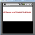
最后看看我们自定义控件的效果吧!
点击后还有按下按钮的效果。

![[转载]android自定义控件实例(Linearlayout组合TextView和ImageView)](/Upload/SmallIMG/2013121812/55C88A203930B792.png)


 相关文章
相关文章![[Web App]必胜客宅急送产品设计思路介绍[转]](/Upload/SmallIMG/2013121810/5C2908B664B9A58D.jpg)