class="brush:java;collapse:true;;gutter:true;">package com.qiao.circleprogress_forexample;

import android.app.Activity;
import android.os.Bundle;
import android.view.Menu;
import android.view.MenuItem;
/**
 * 主页面
 * @author 有点凉了
 *
 */
public class MainActivity extends Activity {
	private RoundProgressBar progressBar1;
	private  int progress = 0;
	@Override
	protected void onCreate(Bundle savedInstanceState) {
		super.onCreate(savedInstanceState);
		setContentView(R.layout.activity_main);
		progressBar1 = (RoundProgressBar) findViewById(R.id.progressBar1);
		new Thread(new Runnable() {

			@Override
			public void run() {
				while (progress<=59) {
					progress+=1;
					progressBar1.setProgress(progress);
					try {
						Thread.sleep(100);
					} catch (InterruptedException e) {
						// TODO Auto-generated catch block
						e.printStackTrace();
					}
				}
			}
		}).start();
	}

	@Override
	public boolean onCreateOptionsMenu(Menu menu) {
		// Inflate the menu; this adds items to the action bar if it is present.
		getMenuInflater().inflate(R.menu.main, menu);
		return true;
	}

	@Override
	public boolean onOptionsItemSelected(MenuItem item) {
		// Handle action bar item clicks here. The action bar will
		// automatically handle clicks on the Home/Up button, so long
		// as you specify a parent activity in AndroidManifest.xml.
		int id = item.getItemId();
		if (id == R.id.action_settings) {
			return true;
		}
		return super.onOptionsItemSelected(item);
	}
}
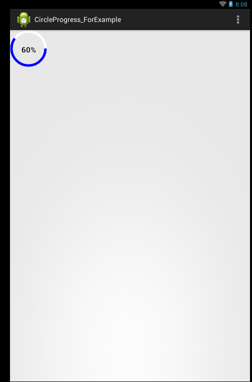
自定义页面
package com.qiao.circleprogress_forexample;

import android.content.Context;
import android.content.res.TypedArray;
import android.graphics.Canvas;
import android.graphics.Color;
import android.graphics.Paint;
import android.graphics.RectF;
import android.graphics.Typeface;
import android.util.AttributeSet;
import android.util.Log;
import android.view.View;


/**
 * 仿iphone带进度的进度条,线程安全的View,可直接在线程中更新进度
 * @author 有点凉了
 *
 */
public class RoundProgressBar extends View {
	/**
	 * 画笔对象的引用
	 */
	private Paint paint;

	/**
	 * 圆环的颜色
	 */
	private int roundColor;

	/**
	 * 圆环进度的颜色
	 */
	private int roundProgressColor;

	/**
	 * 中间进度百分比的字符串的颜色
	 */
	private int textColor;

	/**
	 * 中间进度百分比的字符串的字体
	 */
	private float textSize;

	/**
	 * 圆环的宽度
	 */
	private float roundWidth;

	/**
	 * 最大进度
	 */
	private int max;

	/**
	 * 当前进度
	 */
	private int progress;
	/**
	 * 是否显示中间的进度
	 */
	private boolean textIsDisplayable;

	/**
	 * 进度的风格,实心或者空心
	 */
	private int style;

	public static final int STROKE = 0;
	public static final int FILL = 1;

	public RoundProgressBar(Context context) {
		this(context, null);
	}

	public RoundProgressBar(Context context, AttributeSet attrs) {
		this(context, attrs, 0);
	}

	public RoundProgressBar(Context context, AttributeSet attrs, int defStyle) {
		super(context, attrs, defStyle);

		paint = new Paint();


		TypedArray mTypedArray = context.obtainStyledAttributes(attrs,
				R.styleable.RoundProgressBar);

		//获取自定义属性和默认值
		roundColor = mTypedArray.getColor(R.styleable.RoundProgressBar_roundColor, Color.WHITE);
		roundProgressColor = mTypedArray.getColor(R.styleable.RoundProgressBar_roundProgressColor, Color.BLUE);
		textColor = mTypedArray.getColor(R.styleable.RoundProgressBar_textColor, Color.BLACK);
		textSize = mTypedArray.getDimension(R.styleable.RoundProgressBar_textSize, 15);
		roundWidth = mTypedArray.getDimension(R.styleable.RoundProgressBar_roundWidth, 5);
		max = mTypedArray.getInteger(R.styleable.RoundProgressBar_max, 100);
		textIsDisplayable = mTypedArray.getBoolean(R.styleable.RoundProgressBar_textIsDisplayable, true);
		style = mTypedArray.getInt(R.styleable.RoundProgressBar_style, 0);

		mTypedArray.recycle();
	}


	@Override
	protected void onDraw(Canvas canvas) {
		super.onDraw(canvas);

		/**
		 * 画最外层的大圆环
		 */
		int centre = getWidth()/2; //获取圆心的x坐标
		int radius = (int) (centre - roundWidth/2); //圆环的半径
		paint.setColor(roundColor); //设置圆环的颜色
		paint.setStyle(Paint.Style.STROKE); //设置空心
		paint.setStrokeWidth(roundWidth); //设置圆环的宽度
		paint.setAntiAlias(true);  //消除锯齿
		canvas.drawCircle(centre, centre, radius, paint); //画出圆环

		Log.e("log", centre + "");

		/**
		 * 画进度百分比
		 */
		paint.setStrokeWidth(0);
		paint.setColor(textColor);
		paint.setTextSize(textSize);
		paint.setTypeface(Typeface.DEFAULT_BOLD); //设置字体
		int percent = (int)(((float)progress / (float)max) * 100);  //中间的进度百分比,先转换成float在进行除法运算,不然都为0
		float textWidth = paint.measureText(percent + "%");   //测量字体宽度,我们需要根据字体的宽度设置在圆环中间

		if(textIsDisplayable && percent != 0 && style == STROKE){
			canvas.drawText(percent + "%", centre - textWidth / 2, centre + textSize/2, paint); //画出进度百分比
		}


		/**
		 * 画圆弧 ,画圆环的进度
		 */

		//设置进度是实心还是空心
		paint.setStrokeWidth(roundWidth); //设置圆环的宽度
		paint.setColor(roundProgressColor);  //设置进度的颜色
		RectF oval = new RectF(centre - radius, centre - radius, centre
				+ radius, centre + radius);  //用于定义的圆弧的形状和大小的界限

		switch (style) {
		case STROKE:{
			paint.setStyle(Paint.Style.STROKE);
			canvas.drawArc(oval, 0, 360 * progress / max, false, paint);  //根据进度画圆弧
			break;
		}
		case FILL:{
			paint.setStyle(Paint.Style.FILL_AND_STROKE);
			if(progress !=0)
				canvas.drawArc(oval, 0, 360 * progress / max, true, paint);  //根据进度画圆弧
			break;
		}
		}

	}


	public synchronized int getMax() {
		return max;
	}

	/**
	 * 设置进度的最大值
	 * @param max
	 */
	public synchronized void setMax(int max) {
		if(max < 0){
			throw new IllegalArgumentException("max not less than 0");
		}
		this.max = max;
	}

	/**
	 * 获取进度.需要同步
	 * @return
	 */
	public synchronized int getProgress() {
		return progress;
	}

	/**
	 * 设置进度,此为线程安全控件,由于考虑多线的问题,需要同步
	 * 刷新界面调用postInvalidate()能在非UI线程刷新
	 * @param progress
	 */
	public synchronized void setProgress(int progress) {
		if(progress < 0){
			throw new IllegalArgumentException("progress not less than 0");
		}
		if(progress > max){
			progress = max;
		}
		if(progress <= max){
			this.progress = progress;
			postInvalidate();
		}

	}


	public int getCricleColor() {
		return roundColor;
	}

	public void setCricleColor(int cricleColor) {
		this.roundColor = cricleColor;
	}

	public int getCricleProgressColor() {
		return roundProgressColor;
	}

	public void setCricleProgressColor(int cricleProgressColor) {
		this.roundProgressColor = cricleProgressColor;
	}

	public int getTextColor() {
		return textColor;
	}

	public void setTextColor(int textColor) {
		this.textColor = textColor;
	}

	public float getTextSize() {
		return textSize;
	}

	public void setTextSize(float textSize) {
		this.textSize = textSize;
	}

	public float getRoundWidth() {
		return roundWidth;
	}

	public void setRoundWidth(float roundWidth) {
		this.roundWidth = roundWidth;
	}


}
布局:
<LinearLayout xmlns:android="http://schemas.android.com/apk/res/android"
    android:layout_width="fill_parent"
    android:layout_height="fill_parent"
    android:orientation="vertical" >

    <com.qiao.circleprogress_forexample.RoundProgressBar
        android:id="@+id/progressBar1"
        android:layout_width="100dip"
        android:layout_height="100dip"
       />

</LinearLayout>
属性
<?xml version="1.0" encoding="UTF-8"?>
<resources>
    <declare-styleable name="RoundProgressBar">
        <attr name="roundColor" format="color"/>
        <attr name="roundProgressColor" format="color"/>
        <attr name="roundWidth" format="dimension"></attr>
        <attr name="textColor" format="color" />
        <attr name="textSize" format="dimension" />
        <attr name="max" format="integer"></attr>
        <attr name="textIsDisplayable" format="boolean"></attr>
        <attr name="style">
            <enum name="STROKE" value="0"></enum>
            <enum name="FILL" value="1"></enum>
        </attr>
    </declare-styleable>
</resources>

 相关文章
相关文章