To create complex lists and cards with material design styles in your apps, you can use the RecyclerView and CardView widgets.
The RecyclerView widget is a more advanced and flexible version of ListView. This widget is a container for displaying large data sets that can be scrolled very efficiently by maintaining a limited number of views. Use the RecyclerView widget when you have data collections whose elements change at runtime based on user action or network events.
The RecyclerView class simplifies the display and handling of large data sets by providing:
You also have the flexibility to define custom layout managers and animations for RecyclerView widgets.

Figure 1. The RecyclerView widget.
To use the RecyclerView widget, you have to specify an adapter and a layout manager. To create an adapter, extend the RecyclerView.Adapter class. The details of the implementation depend on the specifics of your dataset and the type of views. For more information, see the examples below.
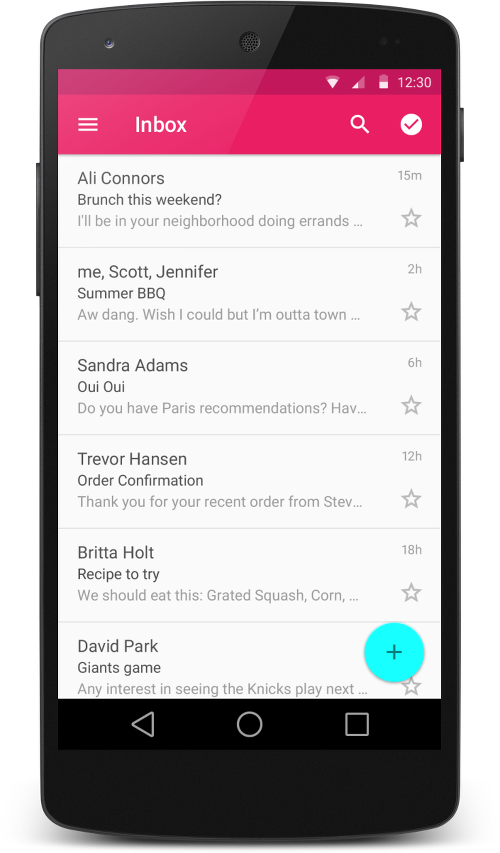
Figure 2 - Lists with RecyclerView.
A layout manager positions item views inside a RecyclerView and determines when to reuse item views that are no longer visible to the user. To reuse (or recycle) a view, a layout manager may ask the adapter to replace the contents of the view with a different element from the dataset. Recycling views in this manner improves performance by avoiding the creation of unnecessary views or performing expensive findViewById() lookups.
RecyclerView provides these built-in layout managers:
LinearLayoutManager shows items in a vertical or horizontal scrolling list.GridLayoutManager shows items in a grid.StaggeredGridLayoutManager shows items in a staggered grid.To create a custom layout manager, extend the RecyclerView.LayoutManager class.
Animations for adding and removing items are enabled by default in RecyclerView. To customize these animations, extend the RecyclerView.ItemAnimator class and use the RecyclerView.setItemAnimator() method.
The following code example demonstrates how to add the RecyclerView to a layout:
<!-- A RecyclerView with some commonly used attributes -->
<android.support.v7.widget.RecyclerView
    android:id="@+id/my_recycler_view"
    android:scrollbars="vertical"
    android:layout_width="match_parent"
    android:layout_height="match_parent"/>
Once you have added a RecyclerView widget to your layout, obtain a handle to the object, connect it to a layout manager, and attach an adapter for the data to be displayed:
publicclassMyActivityextendsActivity{
    privateRecyclerView mRecyclerView;
    privateRecyclerView.Adapter mAdapter;
    privateRecyclerView.LayoutManager mLayoutManager;

    @Override
    protectedvoid onCreate(Bundle savedInstanceState){
        super.onCreate(savedInstanceState);
        setContentView(R.layout.my_activity);
        mRecyclerView =(RecyclerView) findViewById(R.id.my_recycler_view);

        // use this setting to improve performance if you know that changes
        // in content do not change the layout size of the RecyclerView
        mRecyclerView.setHasFixedSize(true);

        // use a linear layout manager
        mLayoutManager =newLinearLayoutManager(this);
        mRecyclerView.setLayoutManager(mLayoutManager);

        // specify an adapter (see also next example)
        mAdapter =newMyAdapter(myDataset);
        mRecyclerView.setAdapter(mAdapter);
    }
    ...
}
The adapter provides access to the items in your data set, creates views for items, and replaces the content of some of the views with new data items when the original item is no longer visible. The following code example shows a simple implementation for a data set that consists of an array of strings displayed using TextView widgets:
publicclassMyAdapterextendsRecyclerView.Adapter<MyAdapter.ViewHolder>{
    privateString[] mDataset;

    // Provide a reference to the views for each data item
    // Complex data items may need more than one view per item, and
    // you provide access to all the views for a data item in a view holder
    publicstaticclassViewHolderextendsRecyclerView.ViewHolder{
        // each data item is just a string in this case
        publicTextView mTextView;
        publicViewHolder(TextView v){
            super(v);
            mTextView = v;
        }
    }

    // Provide a suitable constructor (depends on the kind of dataset)
    publicMyAdapter(String[] myDataset){
        mDataset = myDataset;
    }

    // Create new views (invoked by the layout manager)
    @Override
    publicMyAdapter.ViewHolder onCreateViewHolder(ViewGroup parent,
                                                   int viewType){
        // create a new view
        View v =LayoutInflater.from(parent.getContext())
                               .inflate(R.layout.my_text_view, parent,false);
        // set the view's size, margins, paddings and layout parameters
        ...
        ViewHolder vh =newViewHolder(v);
        return vh;
    }

    // Replace the contents of a view (invoked by the layout manager)
    @Override
    publicvoid onBindViewHolder(ViewHolder holder,int position){
        // - get element from your dataset at this position
        // - replace the contents of the view with that element
        holder.mTextView.setText(mDataset[position]);

    }

    // Return the size of your dataset (invoked by the layout manager)
    @Override
    publicint getItemCount(){
        return mDataset.length;
    }
}

Figure 3. Card examples.
CardView extends the FrameLayout class and lets you show information inside cards that have a consistent look across the platform. CardView widgets can have shadows and rounded corners.
To create a card with a shadow, use the card_view:cardElevation attribute. CardView uses real elevation and dynamic shadows on Android 5.0 (API level 21) and above and falls back to a programmatic shadow implementation on earlier versions. For more information, see Maintaining Compatibility.
Use these properties to customize the appearance of the CardView widget:
card_view:cardCornerRadius attribute.CardView.setRadius method.card_view:cardBackgroundColor attribute.The following code example shows you how to include a CardView widget in your layout:
<LinearLayoutxmlns:android="http://schemas.android.com/apk/res/android"
    xmlns:tools="http://schemas.android.com/tools"
    xmlns:card_view="http://schemas.android.com/apk/res-auto"
    ... >
    <!-- A CardView that contains a TextView -->
    <android.support.v7.widget.CardView
        xmlns:card_view="http://schemas.android.com/apk/res-auto"
        android:id="@+id/card_view"
        android:layout_gravity="center"
        android:layout_width="200dp"
        android:layout_height="200dp"
        card_view:cardCornerRadius="4dp">

        <TextView
            android:id="@+id/info_text"
            android:layout_width="match_parent"
            android:layout_height="match_parent"/>
    </android.support.v7.widget.CardView>
</LinearLayout>
For more information, see the API reference for CardView.
The RecyclerView and CardView widgets are part of the v7 Support Libraries. To use these widgets in your project, add these Gradle dependencies to your app's module:
dependencies {Next: Defining Shadows and Clipping Views Get started Next class Except as noted, this content is licensed under Creative Commons Attribution 2.5. For details and restrictions, see the Content License.
...
compile 'com.android.support:cardview-v7:21.0.+'
compile 'com.android.support:recyclerview-v7:21.0.+'
}
About Android | Legal | Support
![Android英文文档翻译系列(5)――Creating Lists and Cards[创建List和卡片,CardView和RecyclerView]](/Upload/SmallIMG/2015010717/44808AF25D706327.png)


 相关文章
相关文章