在sliverligth中我们往往会自定义一些控件的外观,或者创建新的空间,这里主要通过ControlTemplate来实现。
ControlTemplate类,派生自FrameworkTemplate类,命名空间为System.Windows.Controls;引用程序集System.Windows.dll。
要在XAML中定义ControlTempalte主要有三种方法。
1)将Template本地设置成内联定义的ControlTemplate
1 <Button Content="Button1">
2   <Button.Template>
3     <ControlTemplate TargetType="Button">
4
5       <!--Define the ControlTemplate here.-->
6
7     </ControlTemplate>
8   </Button.Template>
9 </Button>
View Code
2)将Template本地设置成对定义为资源的ControlTemplate的引用

 1 <StackPanel>
 2   <StackPanel.Resources>
 3     <ControlTemplate TargetType="Button" x:Key="newTemplate">
 4
 5       <!--Define the ControlTemplate here.-->
 6
 7     </ControlTemplate>
 8   </StackPanel.Resources>
 9
10   <Button Template="{StaticResource newTemplate}" Content="Button1"/>
11 </StackPanel>
View Code
3)用Style设置Template和定义 ControlTemplate
 1 <StackPanel>
 2   <StackPanel.Resources>
 3     <Style TargetType="Button" x:Key="newTemplate">
 4       <Setter Property="Template">
 5         <Setter.Value>
 6           <ControlTemplate TargetType="Button">
 7
 8             <!--Define the ControlTemplate here.-->
 9
10           </ControlTemplate>
11         </Setter.Value>
12       </Setter>
13     </Style>
14   </StackPanel.Resources>
15   <Button Style="{StaticResource newTemplate}" Content="Button1"/>
16 </StackPanel>
View Code
据说第三种最常见,但一切还是看个人习惯和喜好了。
定义了ControlTemplate后就可以更改控件的外观了,这里可以通过更改控件的可视化结构来完成,也可以根据控件状态来更改控件的外观,当然也可以两者结合起来用。
1)更改控件的可视化结构
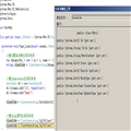
 1 <ControlTemplate TargetType="Button">
 2                 <Border x:Name="RootElement">
 3
 4                   <!--Create the SolidColorBrush for the Background
 5                       as an object elemment and give it a name so
 6                       it can be referred to elsewhere in the control template.-->
 7                   <Border.Background>
 8                     <SolidColorBrush x:Name="BorderBrush" Color="Black"/>
 9                   </Border.Background>
10
11                   <!--Create a border that has a different color by adding smaller grid.
12                       The background of this grid is specificied by the button's Background
13                       property.-->
14                   <Grid Margin="4" Background="{TemplateBinding Background}">
15
16            <!--Use a ContentPresenter to display the Content of
17                         the Button.-->
18                     <ContentPresenter
19                         HorizontalAlignment="{TemplateBinding HorizontalContentAlignment}"
20                         VerticalAlignment="{TemplateBinding VerticalContentAlignment}"
21                         Margin="4,5,4,4" />
22
23                   </Grid>
24                 </Border>
25               </ControlTemplate>
View Code
然后在 </StackPanel.Resources>后面加入以下语句:
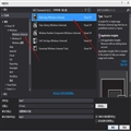
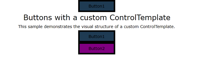
1  <Button Style="{StaticResource newTemplate}" Content="Button1" Width="100"/>
2         <TextBlock FontSize="20" Text="Buttons with a custom ControlTemplate" HorizontalAlignment="Center"/>
3         <TextBlock Text="This sample demonstrates the visual structure of a custom ControlTemplate." HorizontalAlignment="Center" Margin="2"
4                TextWrapping="Wrap"/>
5         <Button Style="{StaticResource newTemplate}" Width="100"
6             Content="Button1"/>
7
8         <Button Style="{StaticResource newTemplate}" Background="Purple"  Width="100"
9             Content="Button2"/>
效果图:
2)根据控件状态更改控件外观
我们可以使用 VisualState 对象指定控件在处于特定状态时的外观,VisualState 包含 Storyboard,用于更改 ControlTemplate 中的元素的外观。
1 <VisualState x:Name="MouseOver">
2   <Storyboard>
3     <ColorAnimation Storyboard.TargetName="BorderBrush"
4                     Storyboard.TargetProperty="Color" To="Red" />
5
6   </Storyboard>
7 </VisualState>
可以将 VisualState 对象添加到 VisualStateGroup 对象中。 可以将 VisualStateGroup 对象添加到 VisualStateManager.VisualStateGroups 附加属性,该属性是在 ControlTemplate 的根 FrameworkElement 上设置的。
<ControlTemplate TargetType="Button">
  <Border x:Name="RootElement">
    <VisualStateManager.VisualStateGroups>
      <!--Define the states for the common states.
          The states in the VisualStateGroup are mutually exclusive to
          each other.-->
      <VisualStateGroup x:Name="CommonStates">
        <!--The Normal state is the state the button is in
            when it is not in another state from this VisualStateGroup.-->
        <VisualState x:Name="Normal" />
        <!--Change the SolidColorBrush, BorderBrush, to red when the
            mouse is over the button.-->
        <VisualState x:Name="MouseOver">
          <Storyboard>
            <ColorAnimation Storyboard.TargetName="BorderBrush"
                              Storyboard.TargetProperty="Color" To="Red" />
          </Storyboard>
        </VisualState>
        <!--Change the SolidColorBrush, BorderBrush, to Transparent when the
            button is pressed.-->
        <VisualState x:Name="Pressed">
          <Storyboard >
            <ColorAnimation Storyboard.TargetName="BorderBrush"
                              Storyboard.TargetProperty="Color" To="Transparent"/>
          </Storyboard>
        </VisualState>
          <!--The Disabled state is omitted for brevity.-->
        </VisualStateGroup>
    </VisualStateManager.VisualStateGroups>
    <Border.Background>
      <SolidColorBrush x:Name="BorderBrush" Color="Black"/>
    </Border.Background>
    <Grid Background="{TemplateBinding Background}" Margin="4">
      <ContentPresenter
        HorizontalAlignment="{TemplateBinding HorizontalContentAlignment}"
        VerticalAlignment="{TemplateBinding VerticalContentAlignment}"
        Margin="4,5,4,4" />
    </Grid>
  </Border>
</ControlTemplate>
所有代如下:
 1  <StackPanel>
 2         <StackPanel.Resources>
 3             <Style TargetType="Button" x:Key="newTemplate">
 4                 <Setter Property="Template">
 5                     <Setter.Value>
 6                         <ControlTemplate TargetType="Button">
 7                             <Border x:Name="RootElement">
 8                                 <VisualStateManager.VisualStateGroups>
 9                               <!--Define the states for the common states.
10                                   The states in the VisualStateGroup are mutually exclusive to
11                                   each other.-->
12                                     <VisualStateGroup x:Name="CommonStates">
13                                         <!--Define the VisualTransitions that can be used when the control
14                                               transitions between VisualStates that are defined in the
15                                               VisualStatGroup.-->
16                                         <VisualStateGroup.Transitions>
17                                             <!--Take one hundredth of a second to transition to the Pressed state.-->
18                                             <VisualTransition To="Pressed" GeneratedDuration="0:0:0.01" />
19                                             <!--Take one half second to trasition to the MouseOver state.-->
20                                             <VisualTransition To="MouseOver" GeneratedDuration="0:0:0.5" />
21                                             <!--Take one hundredth of a second to transition from the  Pressed state to the MouseOver state.-->
22                                             <VisualTransition From="Pressed" To="MouseOver" GeneratedDuration="0:0:0.01" />
23                                             <!--Take one and a half seconds to transition from the
24                                                 MouseOver state to the Normal state.
25                                                 Have the SolidColorBrush, BorderBrush, fade to blue,
26                                                 then to yellow, and then to black in that time.-->
27                                             <VisualTransition From="MouseOver" To="Normal"   GeneratedDuration="0:0:1.5">
28                                                 <Storyboard>
29                                                     <ColorAnimationUsingKeyFrames  Storyboard.TargetProperty="Color" Storyboard.TargetName="BorderBrush" FillBehavior="HoldEnd" >
30                                                         <ColorAnimationUsingKeyFrames.KeyFrames>
31                                                             <LinearColorKeyFrame Value="Blue" KeyTime="0:0:0.5" />
32                                                             <LinearColorKeyFrame Value="Yellow" KeyTime="0:0:1" />
33                                                             <LinearColorKeyFrame Value="Black" KeyTime="0:0:1.5" />
34                                                         </ColorAnimationUsingKeyFrames.KeyFrames>
35                                                     </ColorAnimationUsingKeyFrames>
36                                                 </Storyboard>
37                                             </VisualTransition>
38                                         </VisualStateGroup.Transitions>
39                                         <!--The remainder of the VisualStateGroup is the same as the previous example.-->
40                                         <VisualState x:Name="Normal" />
41                                         <VisualState x:Name="MouseOver">
42                                             <Storyboard>
43                                                 <ColorAnimation Storyboard.TargetName="BorderBrush"  Storyboard.TargetProperty="Color" To="Red" />
44                                             </Storyboard>
45                                         </VisualState>
46                                         <VisualState x:Name="Pressed">
47                                             <Storyboard >
48                                                 <ColorAnimation Storyboard.TargetName="BorderBrush" Storyboard.TargetProperty="Color" To="Transparent"/>
49                                             </Storyboard>
50                                         </VisualState>
51                                         <!--The Disabled state is omitted for brevity.-->
52                                     </VisualStateGroup>
53                                 </VisualStateManager.VisualStateGroups>
54                                 <Border.Background>
55                                     <SolidColorBrush x:Name="BorderBrush" Color="Black"/>
56                                 </Border.Background>
57                                 <Grid Background="{TemplateBinding Background}" Margin="4">
58                                     <ContentPresenter
59                                         HorizontalAlignment="{TemplateBinding HorizontalContentAlignment}"
60                                         VerticalAlignment="{TemplateBinding VerticalContentAlignment}"
61                                         Margin="4,5,4,4" />
62                                 </Grid>
63                             </Border>
64                         </ControlTemplate>
65                     </Setter.Value>
66                 </Setter>
67             </Style>
68         </StackPanel.Resources>
69         <Button Style="{StaticResource newTemplate}" Content="Button1" Width="100"/>
70         <TextBlock FontSize="20" Text="Buttons with a custom ControlTemplate" HorizontalAlignment="Center"/>
71         <TextBlock Text="This sample demonstrates the visual structure of a custom ControlTemplate." HorizontalAlignment="Center" Margin="2"
72                TextWrapping="Wrap"/>
73         <Button Style="{StaticResource newTemplate}" Width="100"
74             Content="Button1"/>
75
76         <Button Style="{StaticResource newTemplate}" Background="Purple"  Width="100"
77             Content="Button2"/>
78     </StackPanel>


 相关文章
相关文章